MAKING OF - BANQUE POPULAIRE ENTREPRENEURS
INTRODUCTION
These images and clips were collected during the process of the sixth Zeitguised advert for Banque Populaire. Our focus this time was to bring a lot of detail through design and animation, and we were also given a little more freedom to develop the story here in Berlin.
In the latest iteration of TVCs for the Banque Populaire campaign, the challenge again was to display human presence and warmth and ingenuity without showing people. We got really excited about the initial brief by the creative team of Agence Babel, to do an assembly line that does not look cold and engineered. So we designed our own version of contemporary DIY heaven unfolding as a self constructed interior universe: conveyor belts and machines that could be made with ready made materials and components found in your local hardware and DIY store, as well as a good ZEITGUISED dose of domestic design elements. It almost broke the bank when the client insisted on some magic to replace some of the quaint mechanisms and to place the entire universe in an even bigger universe, but it all panned out within the event horizon.
- Henrik Mauler
View the whole Banque Populaire project with full credits here
MAKING OF VIDEO
This includes initial animatics through to the final previs as well as a number of tech/mech tests.
BARREN LANDSCAPE
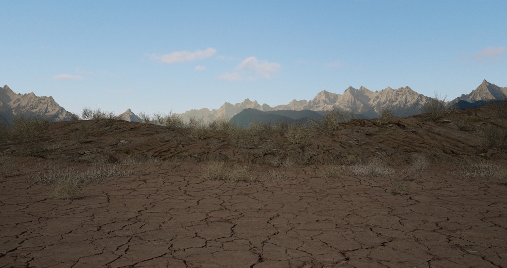
This started as a dry cracked soil ground with the apple tree seedling poking through. Towards the end of the project this was swapped for a more detailed gravel surface with hints of greenery. The gravel was a mix of real geometry so it held up to HD ground level shots and displacement towards the mid-ground.
APPLE TREE
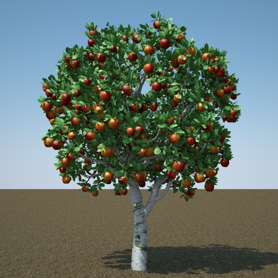
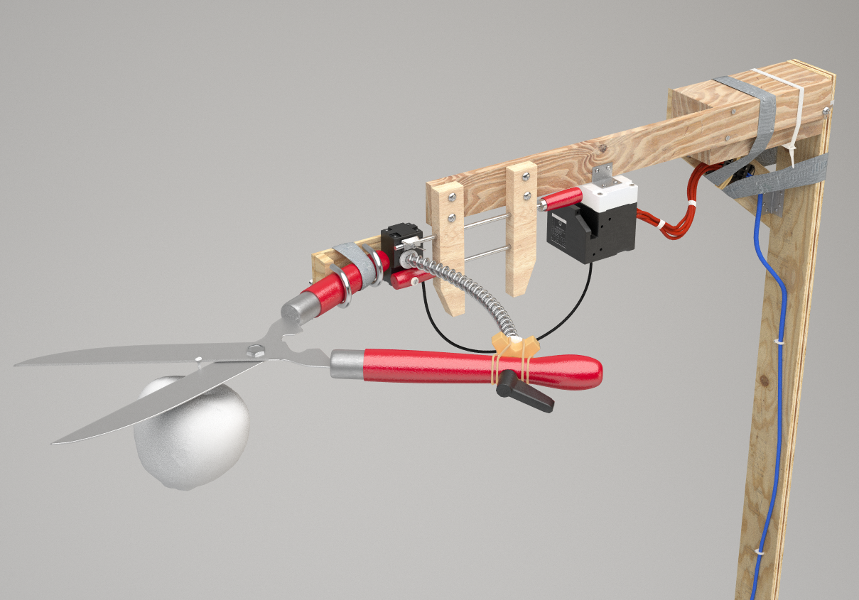
We had DPIT Plants expert Arjo Rozendaal create a couple of apple trees, a seedling and a high resolution branch for the close-up shot. Our new addition Katha Niedermeijer added character by rigging and animating the initial pop-up and the post-snip motion of the apple bearing branch. For the closeup I used a quick dynamic IK rig (on each leaf) to provide some simulated natural bounce.
To achieve the dynamic look of the main apple tree leaves I pinned the first two vertices of each to Katha's animation. I then used Remotion4D's UniFlex plugin to simulate the motion. For the gravel directly surrounding the tree we used C4D's MoGraph and Dynamics. - Julius Steinhauser
HUT
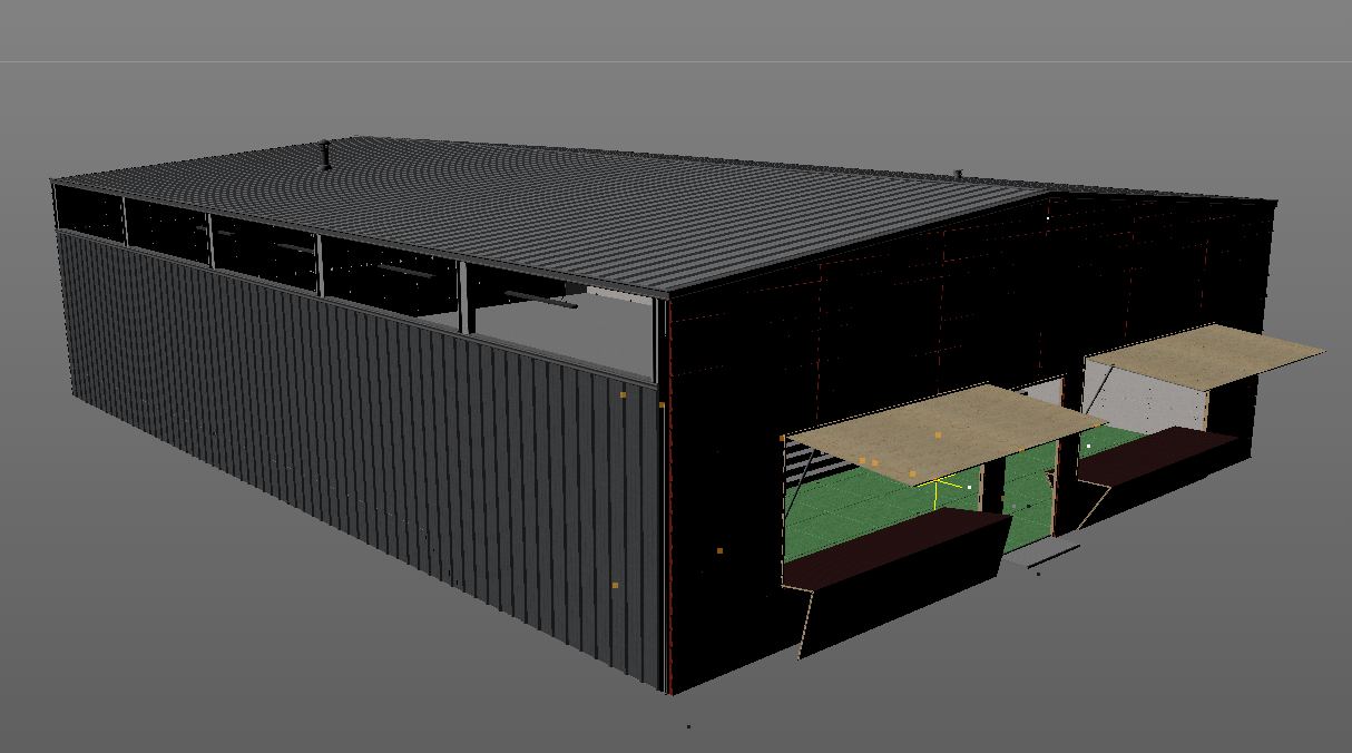
The main aesthetic of the spot was DIY so it only made sense to start the journey in something that resembled a shed. We added a greenhouse roof to a) allow light into the scene and b) not kill the apple tree by halting photosynthesis! Throughout the project there was an ongoing discussion about how much the motion design should be driven by 'magic' (as the client wished) and how much was driven by our self made constructions; the initial architecture flew in rather flamboyantly from the sky!
FACTORY
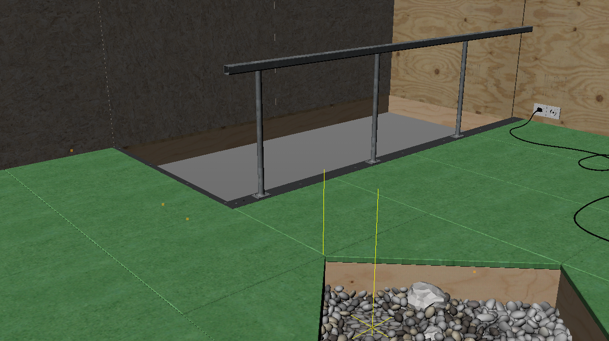
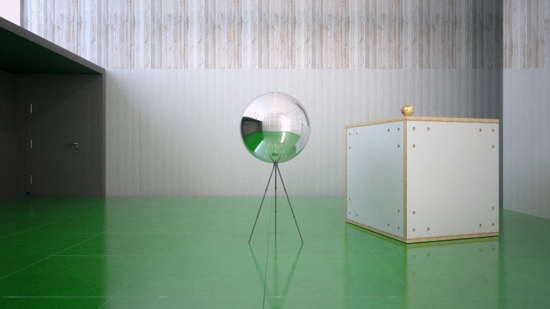
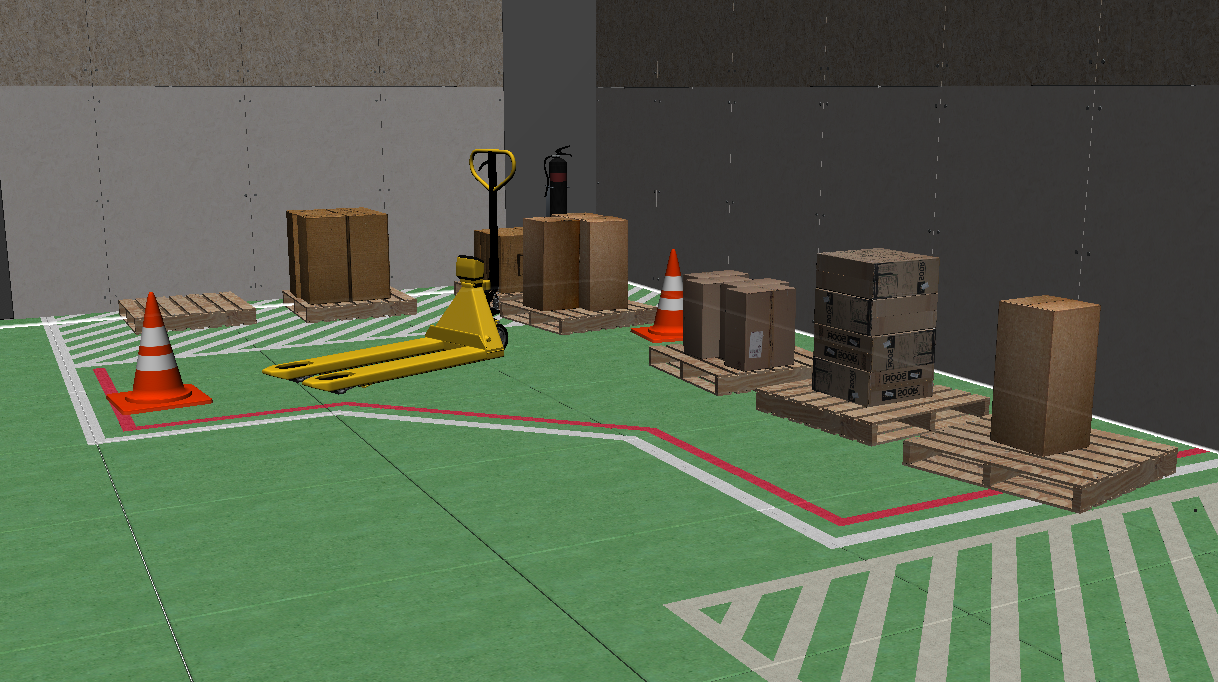
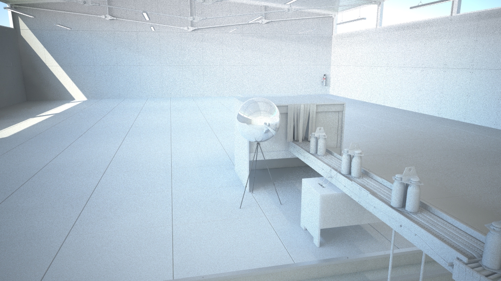
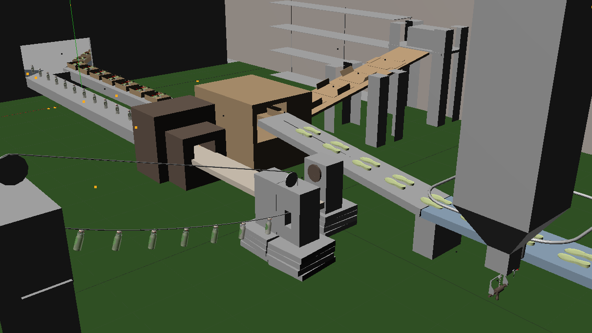
The main venue! We had to leave ourselves room to set up shots of the production line from any angle so we kept the lighting pretty even with simulated daylight entering both sides of the room and used fill lights on a per shot basis. The architecture followed the design of the hut as it was basically a grown up version - wood facade washed red and green tiles on the floor with bare OSB interior. The front wall would later open up to reveal a store front so a whole new rigged facade was built for the end shot.
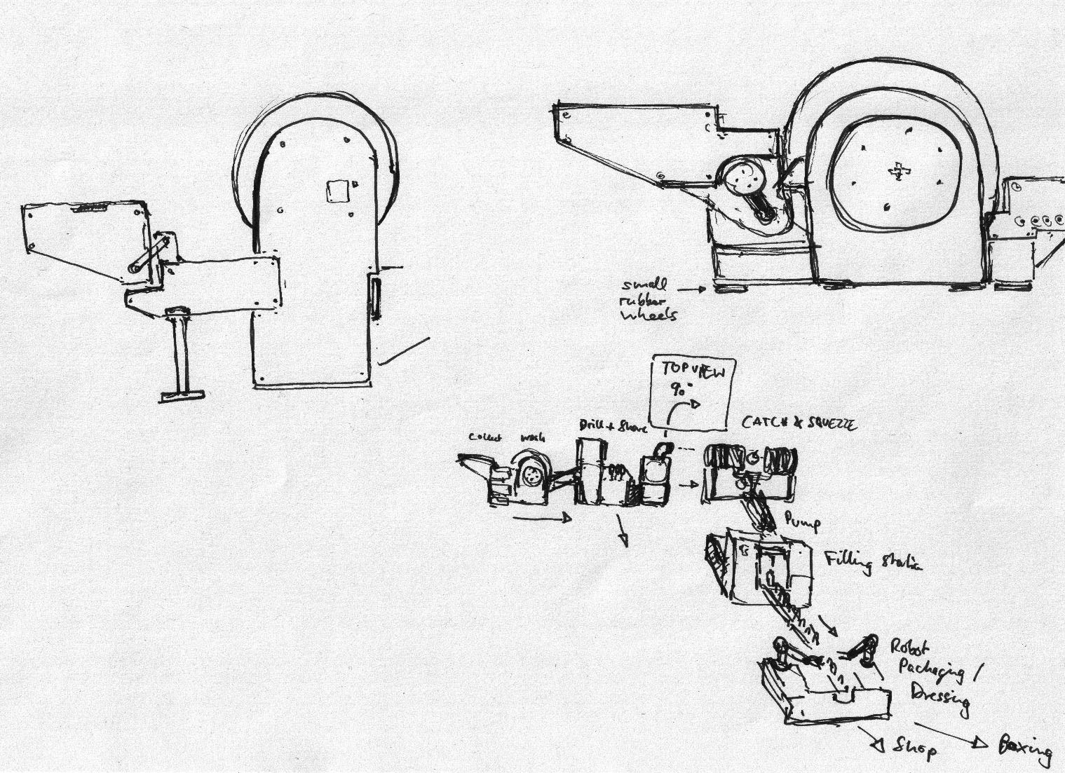
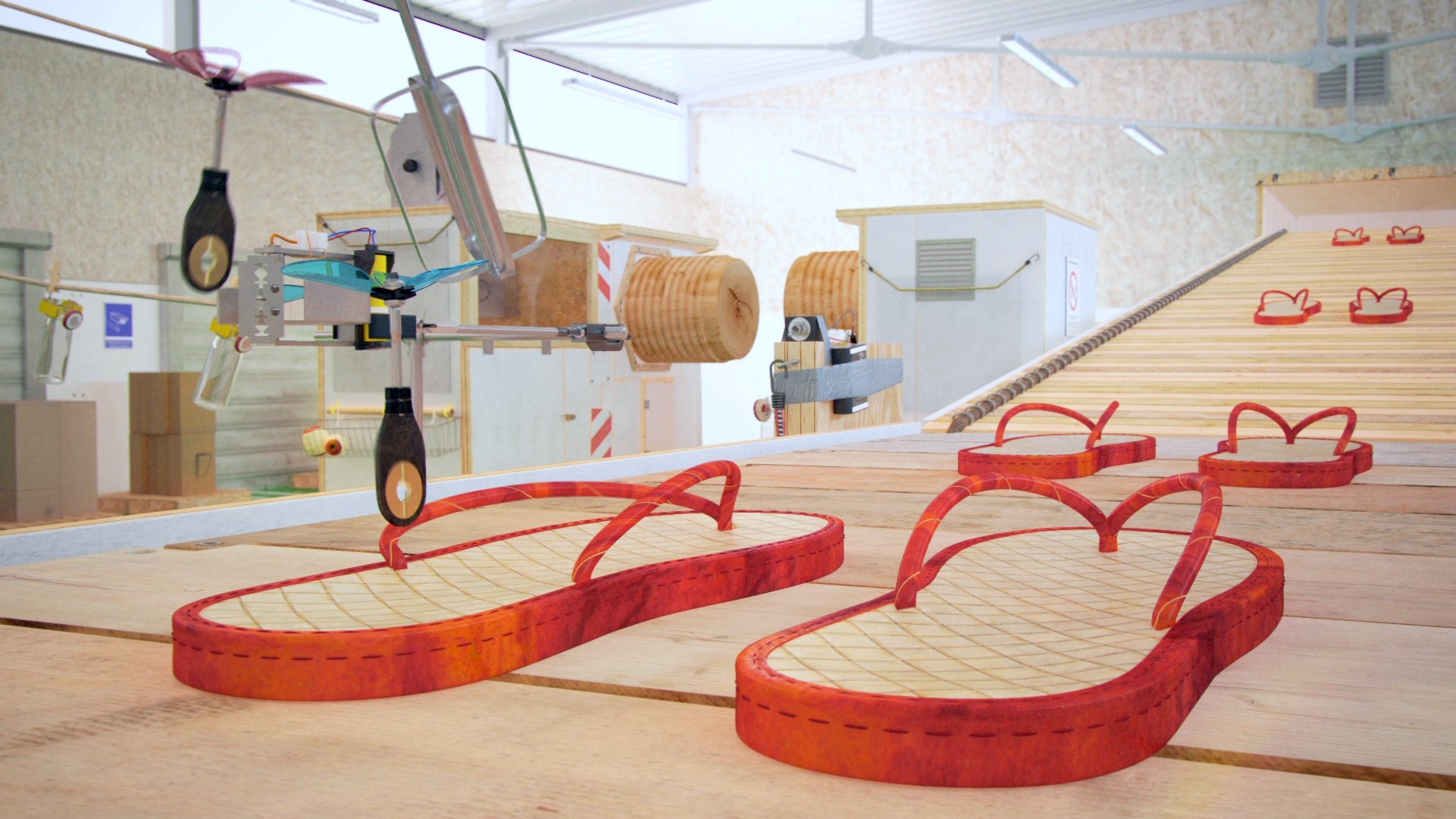
One of the first things we did was determine an overall route for the apple and its products to travel. Keeping the flow parallel initially as the peel was sewn into flip flops and the flesh was pressed into juice allowed the establishing shots to show multiple stages of the process at the same time. This parallel motion continued to the end but in a more linear fashion right out into the store which in turn was split in half.
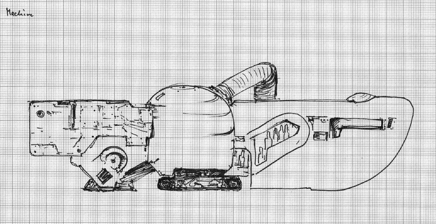
MACHINE DESIGN
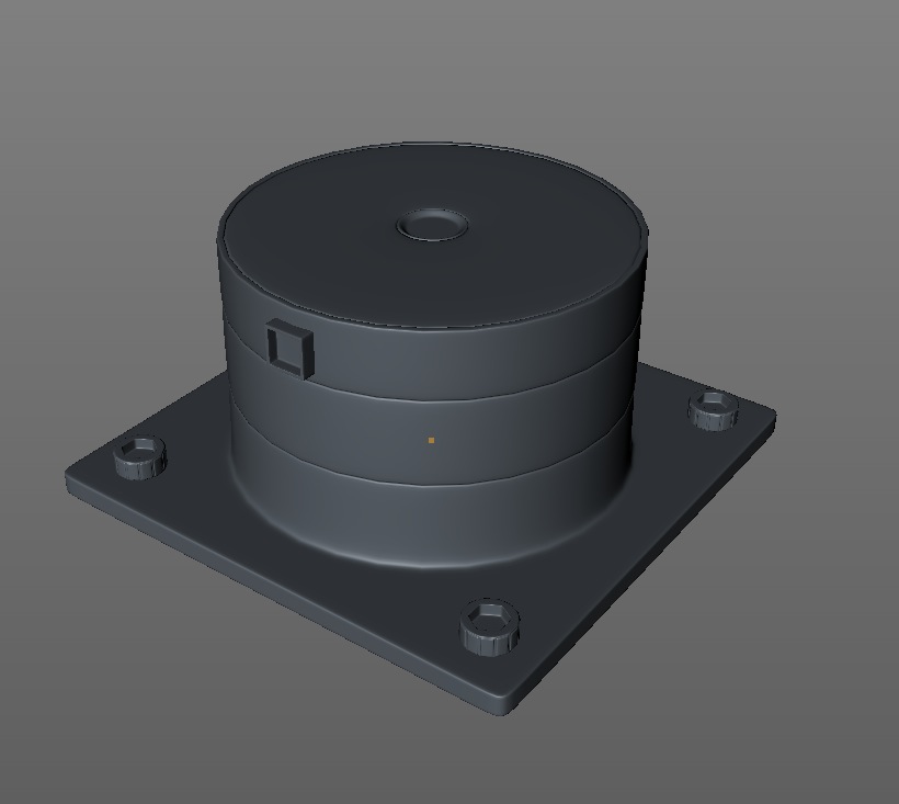
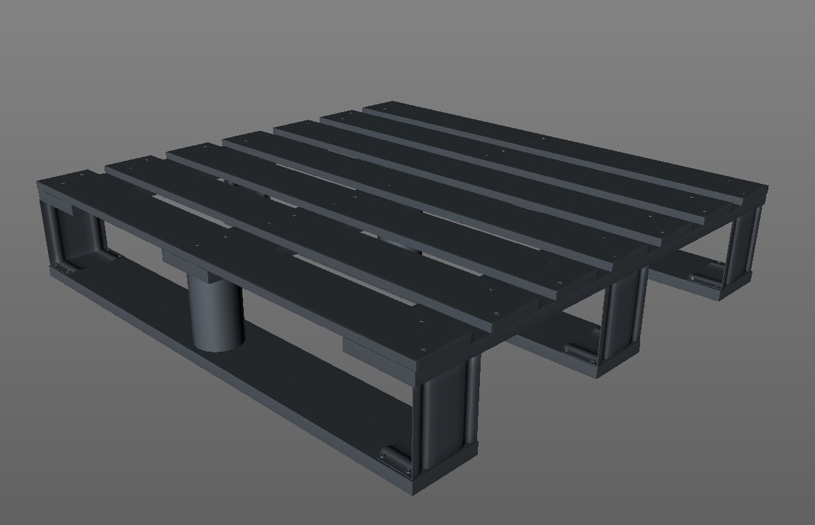
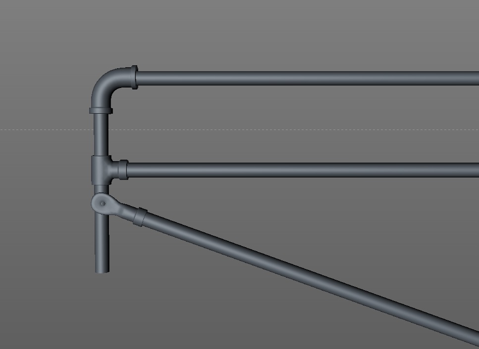
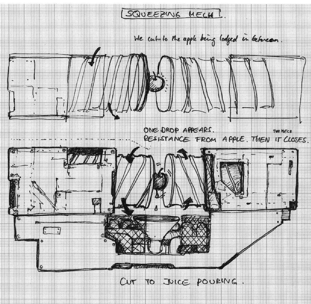
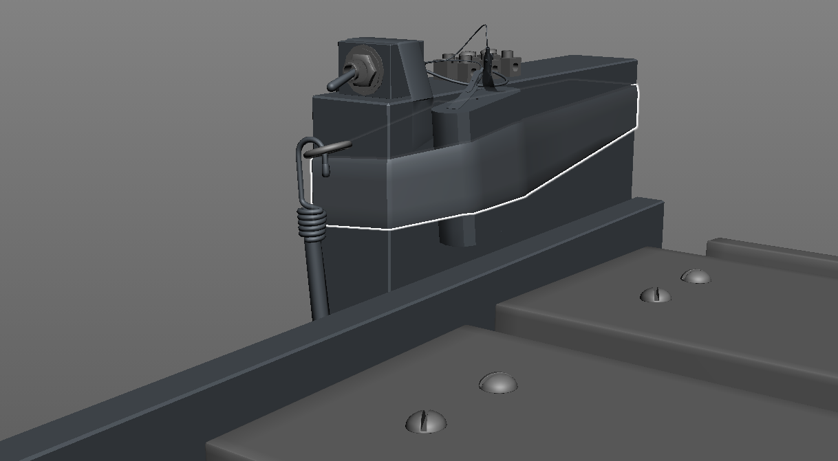
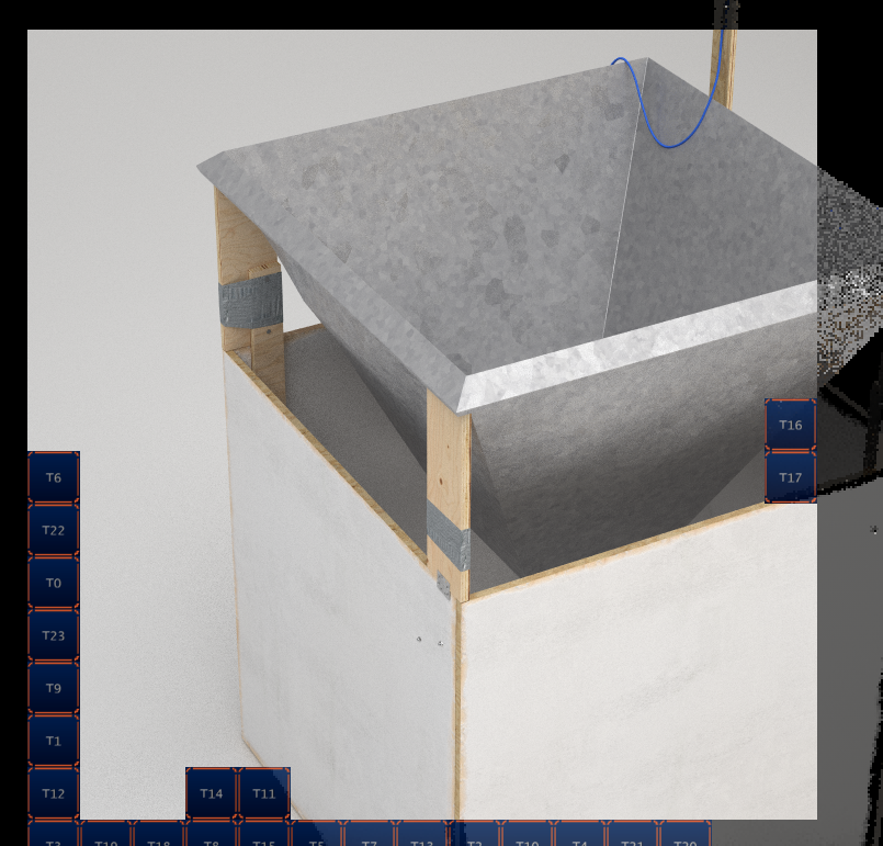
This occupied the bulk of the work during production was the creation of our self-made DIY inventions. I created hundreds of models down to individual types of screws to give a huge variation in the construction. We (and the client) were conscious not to let the design get too messy or thrown together, it should rather be technically constructed with minimal materials and tools, without an engineer's perfectionism.
Late in the project some of our power sources were hidden and our more precarious constructions were stabilised (possibly for health and safety reasons!)
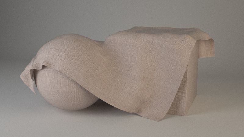
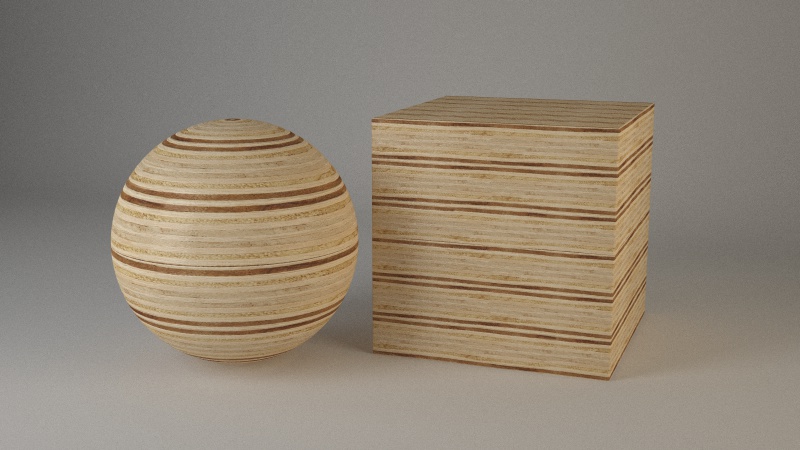
"To support the DIY character of the machines I made variations of Ply Wood, Painted Wood, Plastic, Metal and Fabric materials which you would find in your local DIY market."
"Once the machines were designed I created simple controls putting the components in relation via Xpresso. Eventually each conveyor belt had only one parameter to control the distance of travel which made it easy to animate.
After some tests with dynamic setups for the swinging bottles on the rope I decided that traditional hand animation would be the most fitting approach for this shot." - Julius Steinhauser
PRODUCTS
The very first script we received actually featured three products spawning from the apple. The great thing about Cinema 4D is it provides the tools to allow me to throw together a scene and some camera moves VERY quickly. I boxed out an animatic during an afternoon, after visualising how little time there would be within our allocated 25 seconds of the TV advert we were able to focus on two: juice, and flip flops (we in the studio are still rather skeptical about the suitability of apple skin as a material to fashion footwear from!)
The bottle design was inspired by classic recyclable beer and lemonade bottles. Marian took inspiration from cardboard fruit crates hen designing the shoeboxes for the flip flops to be stored and displayed in.
SHOP
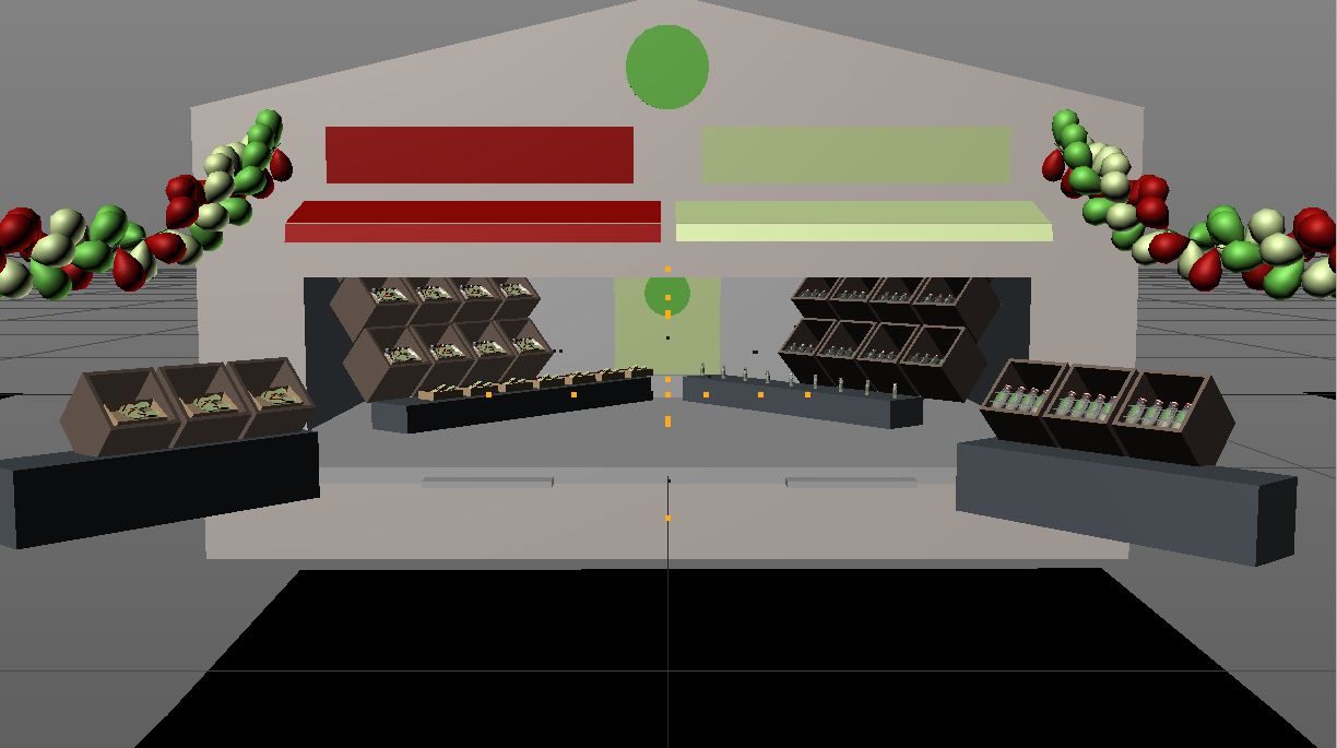
This quick fly through scene was mainly a collaboration between Jamie's interior design eye and Henrik's lighting skills, as well as Katha's poster design. The last few products initially travelled directly from the factory to their final position in shop but a last minute change added a less subtle wipe-on of the shop's entire stock (thank you Mograph!)
LANDSCAPE
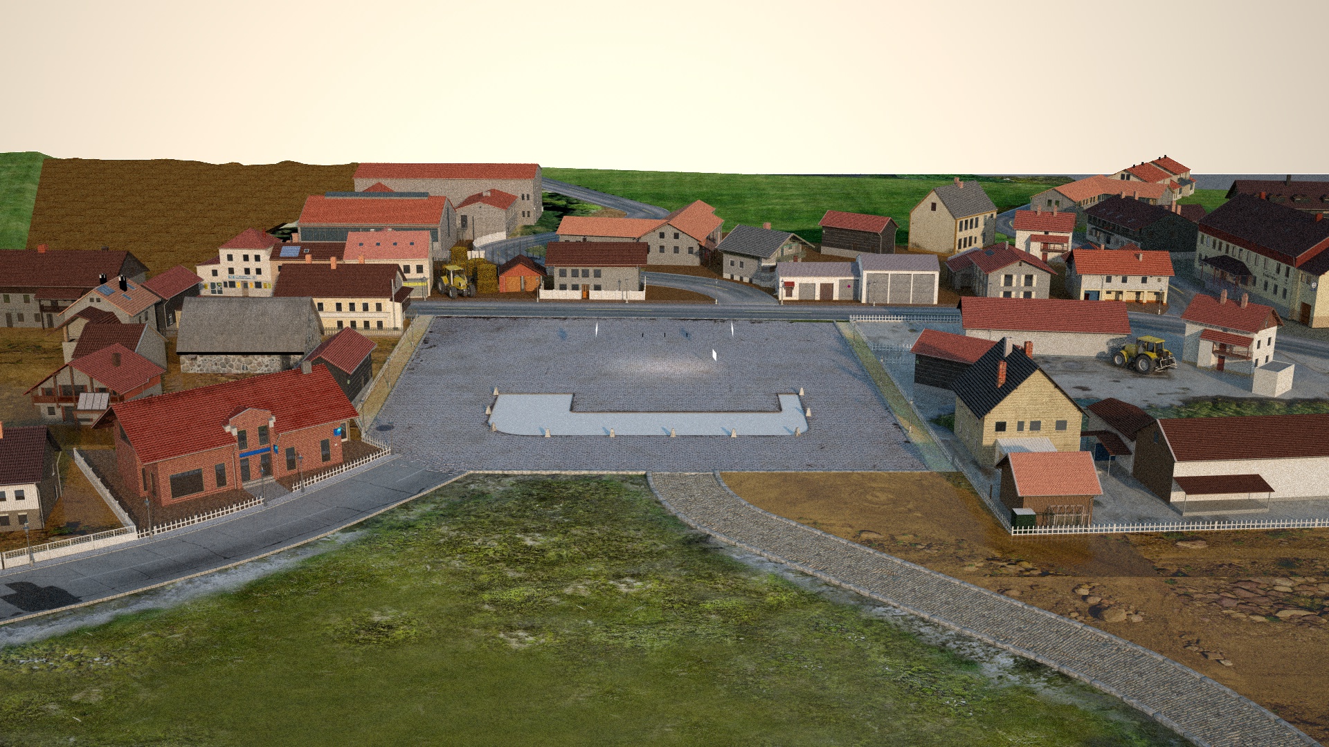
The client was eager to present the factory in a greater context to show how the bank helps to develop a region and visualise its progress from barren wasteland to a flourishing landscape. We called on Michael Tschernjajew to get us most of the way on this big task while we concentrated on the geeky things inside the factory. Marian and myself then got to work on adding more landscape details and Julius drove some cars around to make the place feel a little more lively. You can also spot our flying machine from the Banque Populaire 'Mutual' advert in someone's back yard...
COMPOSITING & GRADING
"To bring all the render passes together and give them a final touch I made some colour adjustments, used Lenscare Depth Of Field, Reelsmart Motionblur, a slight hint of lens flare and finally overlaid some dust and grain in 3D space."
FINAL TV ADVERT
This is the 40 second directors cut, with music and sound by Michael Fakesch
