MAKING OF - LESS THAN JAKE / DO THE MATH
INTRODUCTION
I feel like this one's been a long time coming. I've worked on a couple of Less Than Jake projects over the years but never a fully animated music video. The seed for it was planted over a year ago when Vinnie sent me an email containing lyrics for the entire new record 'See The Light', way before it's release. It was like an extreme version of a routine I had as a kid, reading a new CD booklet on the bus ride home before listening to the album when I got home; ideas and opinions start to form before the song ever hits your ears.
When I arrived at Do The Math, the lyrics seemed particularly affecting. Without getting too personal, the last couple of years have been a struggle regarding life balance. The frustration of time slipping away while having limited energy to expel took its toll (thankfully I was able to make changes and start to turn that around). When I finally heard the record a couple of months later, it came as no surprise that the heavy lyrics I'd read for this particular song were set to the most uplifting singalong music on it.
Cut ahead to sometime early this year and we started discussing a music video, it seemed really fitting that I would be asked to make the video for this song and luckily the timing fell into place. I set aside a month just before the single's release to produce it, with a bit of a soft lead-in for some character design and rigging.
CONCEPT
The first line of the chorus is as follows...
"I count on one hand what matters to me most, only time can subtract them I suppose"
You can make a fairly accurate assumption about what really matters to most people, but family and friends don't make for a particularly entertaining animated music video! (Besides, they had their friends well and truly covered in the last video for 'My Money is on the Long Shot'). I wanted to play with this idea that runs through Less Than Jake's history of heavy subject matter juxtaposed with a lighthearted delivery. I asked each band member if they were to literally count on one hand, what would be the five things that mattered to them most (with one rule, excluding the obvious 'real' answers mentioned above). When the answers came back I quickly set to work creating a large cast of characters to star in the video.
CHARACTERS
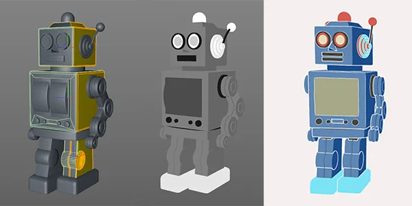
The non-narrative-pseudo-character driven idea stemmed loosely from these old drive-in commercials with dancing hotdogs and mustard (yes, they make a direct appearance). The inspiration pool quickly expanded and I'm sure a lot of the references are absolutely clear. Cinema 4D was my main tool for the bulk of the work, I wanted a 2D final look but for speed, accuracy and control I stayed in 3D to create the animation.
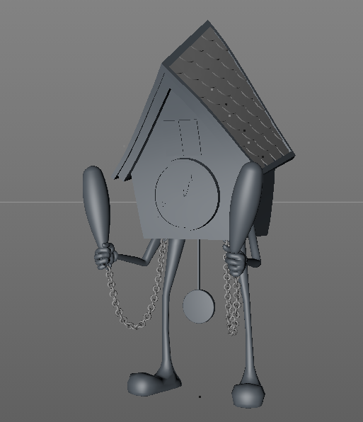
For the most part, the characters consist of a pair of legs with a stylised object stuck on top, then a small number also have arms. For the first time I made use of C4D's 'new' character tools for creating the rigs and CMotion object for walk, run, jump and bounce cycles.
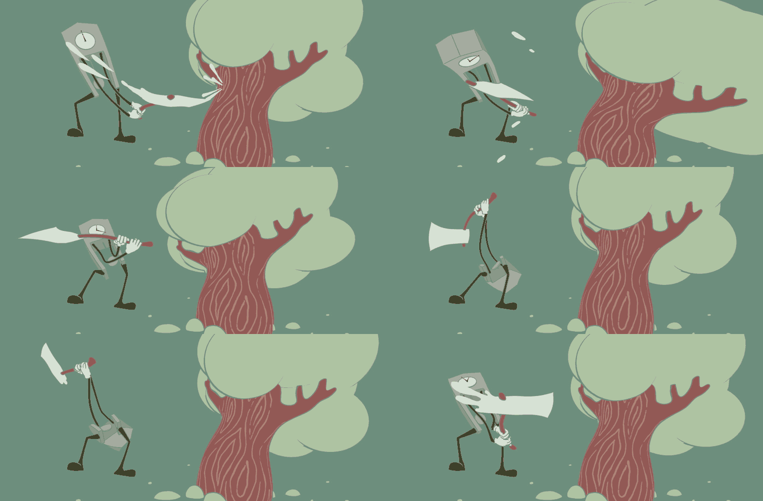
The antagonists were a gang of clocks, armed with weapons and tools ready to 'subtract' the other characters. They go unopposed, it's absolutely not a fair fight, have you ever tried fighting time?
ANIMATION
The controllers built into the Character Object are really nice, especially the feet and hands. To build this from scratch would take me weeks which I didn't have. One issue I have is that it's pretty tricky to break out specific body parts and retain this control. For example individual hands have to be added to arms which must be added to a main torso; a zombie hand doesn't need a torso so I had to do a lot of digging around to extract the necessary components!
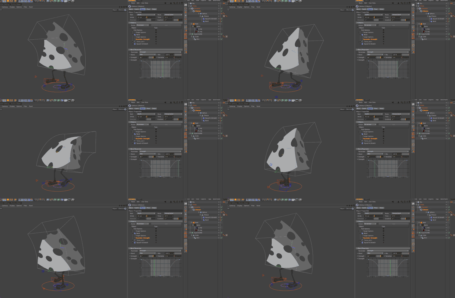
The CMotion object is a new discovery for me, it's a little confusing at first because when you click 'add walk' from the Character Object you get a list of 50 controllers thrown in there. After learning how it works, and more importantly that you can add pretty much any object with any parameter it became really useful. For most of the main body movements I used deformers, the important thing was to overlap all the motions to get a loose bendy feel to the animation. Coupling the main foot and torso controllers with squashes, bends and twists within the CMotion object gave me great walking loops for every character as a starting point which could be copied and adjusted really easily.
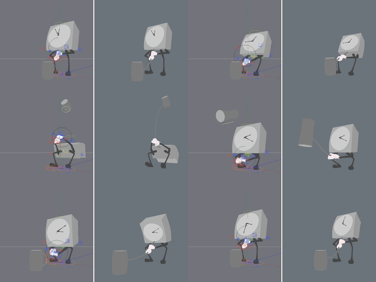
For the rest of the actions I spent a lot of time in the FCurve manager (or as much as I could afford). Time was short, so for the most part I went straight ahead and started with spline keyframes then adjusted the curves afterwards. Some actions required starting with step keyframes to get the timing and weight correct.
RENDERING
This process was kind of interesting, I decided early on that I wanted to retain control of the colours throughout the project. Because I was working with so many short shots and not sequencing them until later, I didn't want to waste time constantly re-shading things in C4D. Instead, I output greyscale image sequences to be recoloured in After Effects.
I made polygon selections to apply different values so I wasn't relying on any lighting at all, consciously choosing areas of colour as if I would during hand colouring a 2D frame to give a more illustrative feel.
I'm absolutely expecting someone to tell me I'm stupid and provide an alternative solution (watch this space...) but I found that I had to use a fairly specific workflow to get the result I wanted. Using the 'Change to Colour' effect allowed me to pick a grey value to change, and a specific RGB value to replace it with. Unfortunately, but understandably, this didn't work very well with anti-aliased renders so I had to render without AA at a much larger resolution. Once coloured, I reduced the size of the comp and got smooth edges. This was helped further by the edges being broken up with Sketch & Toon lines.
I rendered lines from Sketch & Toon (these could be rendered at regular resolution) and used them inversely, subtracting the background colour from the characters to create outlines. I wanted to give some definition without the heavy toon-line look. I did quite a bit of manual work in photoshop to the line renders to clean them up or add specific details. I don't have a huge amount of experience with Sketch & Toon so for short shots rather than waste an hour tweaking settings it sometimes makes more sense to head into Photoshop for 10 minutes and just create the desired result quickly by hand.
2DFX
I wanted to add some real 2D elements to some of the shots, I tried to inject as much cartoony action into my 3D rigs as possible but there's never a replacement for hand drawn shapes and lines. I took otherwise finished shots into Photoshop and just used simple video layers to draw directly over the top, straight ahead frame by frame. There is nothing fancy workflow-wise, it was just a case of gathering a lot of reference and failing a few times. I had a lot of fun experimenting with explosions, smoke, fire and coffee!
Sometimes it was just a case of adding some exaggerated stylised motion blur to broad movements. The best information out there about the (many) processes possible in photoshop is clearly laid out by Alex Grigg here.
